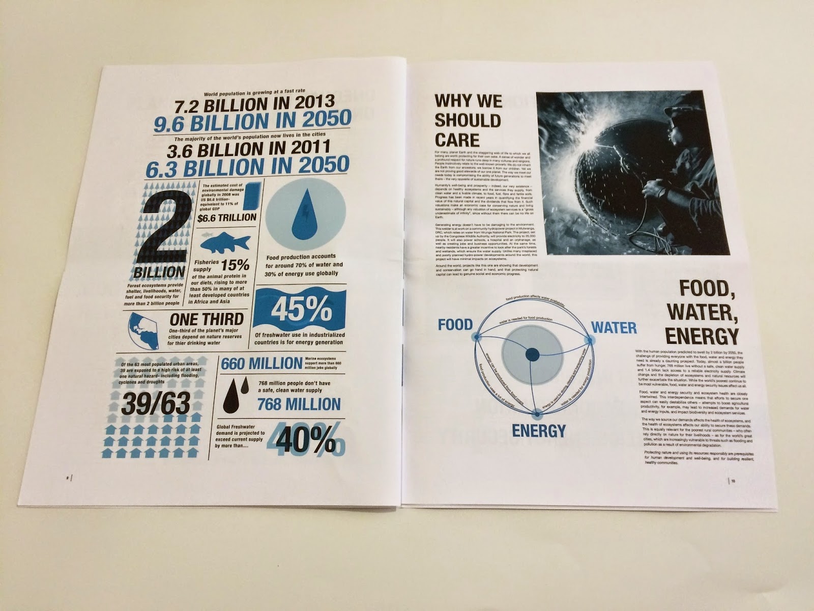
The first print out of the report, I had to scale down the publication as it wouldn't print at the size I had designed.
I printed on thin white matte stock, ideally I would of liked to print on recycled stock as it would suit the publications ethos more.
I think that the colour came out well, and I liked the proportions of the type and the imagery.
I liked the balance of colour type and imagery on this spread, the photograph draws you in.
I also liked how the footprint info graphic worked, I do need to add some more countries to the print to make it fuller and to show a range.
I really liked this spread too, I think that the left hand side works particularly well, and the space on the right hand side allows visual space.
On the back the type turned out to be too big, and I felt that it needed some more information to link to the website and WWF.


No comments:
Post a Comment