Showing posts with label Competition Brief. Show all posts

Wednesday, 13 May 2015

Monotype Evaluation

Monotype Evaluation

This brief pushed my idea of typography and my skills in typographic design. I think that I was steered towards this brief due to my own personal interests; I don’t feel that the brief wasn’t suitable for me but I think that it may not have been the best. I struggled with the idea of only using type to create a film poster as I think that films are image based they may not convert well to type only solutions.

I did a lot of digital development concentrating on the posters and how I could make them interesting; I wanted to do them justice. It showed me that I wasn’t as confident with designing film posters and that it may not be by strongest area of design.

However once I had come up with the final outcomes of the three posters I found it easy to apply them to a range of mediums that I think where effective and enhanced the brief a lot.  This showed me by ability to apply a design to a range of outcomes, and I thought more into what appropriate deliverables could be. I also felt that I had done this brief in quite a small space of time at the end and I was happy that I had managed to get the brief done in time for submitting it to D&AD as I had started my full time placement on the same week.


Although this process of working and then doing this was tiring I think it pushed my abilities and I would of in future had this brief finished before I had started working on placement.

Friday, 8 May 2015

Monotype Collateral

Social Media Promotion- Digital TouchPoint
The digital touch point of the campaign would be through social media such as facebook and twitter on the IMAX accounts. Encouraging fans to share and like the event the message would spread quickly, as would special hash tags on twitter. 

Fans would also be encouraged to share the event to be entered into the competition draw with a chance to win free tickets for them and a friend to all three films. 


 T-Shirt Application and Promotion- Other touchpoint
Further promotion could be through special limited edition T-Shirts sold for the event, there would be one design for each film, this would feature the main typographical image of the film poster on the front, which gives a hint as to what film it is,
On the reverse of the shirt would be the name of the director, the film and the date of the overall event. The colour of the T-Shirt is the dark blue which is used on all of the posters and promotion making. 


Indoor/ Outdoor Advertising
The posters can also work as large scale posters for indoor and outdoor billboards. This would also reach audiences that aren’t/ or don’t access a digital platform. The posters don’t change for these advertisements as they are the same scale. 


Wednesday, 29 April 2015

Type Posters Research

Initially after deciding which director I was going to focus on I felt that the next and secondary part of the research was to look into typographic posters. 


https://www.behance.net/gallery/24395215/Refinery-29


https://www.behance.net/gallery/17449717/The-Hungarian-Guggenheim


https://www.behance.net/gallery/23930261/Made-of-Two-Posters


http://designspiration.net/image/24632824092693/


http://designspiration.net/image/1272206301412/


http://designspiration.net/image/3231015160056/


http://designspiration.net/image/8016793267014/


http://designspiration.net/image/14605972283680/


http://grainedit.com/2014/01/22/les-graphiquants/


http://graphic-porn.com/post/16545009735/http-www-maciejratajski-com


https://www.behance.net/gallery/Ministry-of-sound-_D-AD-Brief/3376983


https://www.behance.net/gallery/17195287/Lamantin-Identity


https://www.behance.net/gallery/24227613/EXTENSION-2014


https://www.behance.net/gallery/24199007/STROKE


Wednesday, 10 December 2014

Fedrigoni Presentation Boards


Presentation of the poster I designed promoting Fedrigoni's new Sirio Ultra Black range,  (brief from YCN 14/15) 

I think that in the future before I submit this work to YCN I will need better photographs and I am also still unsure as to whether I am going to create something to go alongside the poster promotion as I feel it might need something more that would explain and show the paper range in more detail. 

Sunday, 7 December 2014

Fedrigoni Final Poster

The final poster... 

I stuck the layers of the panther (card) together, I then stencilled and cut out the eye from the square foil, after sticking the layers together, I could then apply this to the poster. 

I measured up the alignment and then added the image to the poster, 

I really like the effect it had and I think that the silver foiled eye really connects the type to the image. 

I feel that when the poster is in front of you physically its quite dramatic, and I am happy with the results. I like that I have created the poster from more craft like and traditional techniques. (Foiling and Laser-cutting) 

The way the panther laser cut would show the stock range would be through the different thicknesses of the layers. 

I think that the card is an off-black, when I received the examples of the ultra black range, I felt that this card was definitely black, and the laser cut would look even better on the Fedrigoni stock, as would the foil. 

This poster works as a subtle promotion, due to the audience (which is designers etc) they would contact Fedrigoni to find out more information anyway. I think that it could be displayed as a piece of work or an advertisement, in design studios etc. 


Monday, 24 November 2014

Poster/ Print Digital Development

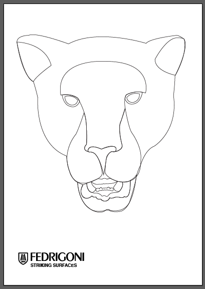
And so I knew that the face would work and I could use it in a special print/ poster. 
I looked at the wording and what needed to be included , and so I went back to the brief.


I found that in the brief they had described their papers as 'striking surfaces'  and I thought that this relates to the panther as they would strike and it also is a word thats relates to the sense of power I was trying to achieve. Striking also means interesting/ out of the ordinary, something strong and prominent and I think this is a good message for the paper range. 


I also gave a brief description of the paper range, (which was also on the brief)  and Included the logo as I feel that it is needed. 


I experimented withe the alignment and positioning of the text, 


I quite liked this central design but the logo makes it look slightly off balanced as the badge is taller than the x-height of the logo. 
In this I also had tried to see what it would look like with the logo as the biggest word on the page. 


I didn't really like that the logo was the first in the hierarchy so I changed it, I also wanted to see if it would work if I removed the body copy and just had the name of the paper range and the logo, this is almost at its simplest form of communicating what it is. 


I felt that the copy sells the paper range on not just its new colour but it explains how and explains the range, and so I changed back to what I had originally put.


I reflected on the design, and I felt like there was something missing and it looked a little bit too plain, 

And so I thought about the word striking in relation to the panther and a panther would maybe strike with its claws, and so i thought about a scratch, but I didn't want to create the stereotypical paw scratch marks and so I kept it minimal by having one straight line instead, cutting through the title 'striking surfaces'


I did like it without the line and then I thought about the print and I felt that a line would almost frame the image and it would look more like a scratch/strike. 


Once I had the text, I began to change the image of the panther to see the relation between type and image.


I then looked at this half face composition and I like how it works along the angle of the line, I also think that if the text and the inner eye is one colour and the rest is black it will be really interesting and eye capturing. 


I decided on the design below I think that it is really interesting and the half face 


And so I had to set up for laser cutting again as this time the panther face was bigger (to fit A3) and there was now half a face, which would still be relatively easy to cut on the laser cutter. And so I had to as before break up the layers of the face and this is how it appeared this time... 


(Original image/ How all the layers would look together) 

I started with the half face so I knew what each layer would need to look like.


I went back to the previous laser outline set up I had created and I enlarged it using the above image as a size guideline, I cut the face in half by drawing a line and using the pathfinder tool to divide the face in half, and then deleting the other side. 


On some of the pages I had the same outline repeated so that I could create thiner layers and create more depth. 

Mouth Detail


Depth Scale of the Layers.


View of Final Panther Face

The face will be used on the final poster, but I am waiting on the Fedrigoni sample pack as I wanted to see whether the embossed paper could be used for part of the panther, which would show of the range and create a texture, making the panther even more detailed