I really like the concept of this home and living store, it has been well thought out and I like the vector illustrations, the brand is quite feminine and cute looking yet modern and simple. The lowercase font is more friendly.
I think that this illustrates the idea and concept, I like the idea of comfy/ cosy.
Its good that the illustration/ logo mark has been used as an icon and I think that this works well, i'm unsure how appropriate the icons are to the sector, I feel that this style takes this into a really cute aesthetic which is not something I would be aiming for.
The bags look really good, the pattern works very well, I like the pattern style of illustrations and type.
https://www.behance.net/gallery/18227753/Sukku-Oriental-Store
This store has a clear style, but I think that the way it has been done and is presented comes across well, and it is appropriate.
Again using simple line vector illustrations, which I like.
It is a good idea to show a range of applications and I will consider this in my own project.
https://www.behance.net/gallery/16829701/Home-Brand-Overview
The newsletter and logo ontop of an image works much better than on the grey above, I fell that the grey/ purple doesn't compliment the yellow.
However I do really like the imagery and I will have to think about a range of shots and focuses in my own piece- i will be using the photographs of others as I don't have a store to photograph or interior set up.
Again even thought the logo looks better here as it is quite fine it becomes unreadable with the highly detailed imagery in the background.
This poster or spread is a completely different style to the above work, and I think that I need to remember to keep a consistent style and brand guidelines will help that.
https://www.behance.net/gallery/18704863/home-addicts-
This is a simple branding project, again using a simple line vector illustration style, I like how it has been applied and how the logo works in both colours, I do feel its a little boring.
https://www.behance.net/gallery/20545027/Monologue-London
I really like the colours of this they compliment each other, and I like the use of the imagery which creates the pattern/ identity, I like how the brand has been applied.
https://www.behance.net/gallery/21824499/Domiduca-Homeware-Furniture-Shop
I like the square around the name and how this overlays the image, I'm not keen on the colour scheme though.
This tag is very realistic and applicable, its a good thing to show in relation to a home and living store. I like how it shows a range of swatches and the price its very clear and concise.
https://www.behance.net/gallery/23572375/Move-in]
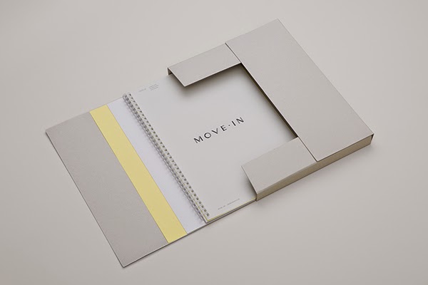
I really like the name of this project, I also like the colour scheme it is soft and inviting, it is simple and modern which I like.
I like how the shapes of the letters have been used separately as stylistic elements.
The app allows follows the brand style it is very clean and modern.
I like how the format of the brochure and the separate yellow element on the front with an image that draws you in.
Home Decoration Companys
A list of companies that only sell home furnishings/ living decoration and accessories.
The ones in blue that I have highlighted are my favourites.
http://www.ikea.com/gb/en/
http://www.thewhitecompany.com/home/
http://www.johnlewis.com
http://www.coxandcox.co.uk
http://barkerandstonehouse.co.uk
http://www.habitat.co.uk
http://www.heals.co.uk
http://www.dunelm-mill.com
http://dwell.co.uk
http://www.mfi.co.uk
http://www.lauraashley.com
http://www.therange.co.uk
http://www.conranshop.co.uk
http://www.athomefurnishings.co.uk
http://homedecorinc.net
http://www.homeclick.com/#.
http://www.hermanmiller.co.uk
http://www.potterybarn.com
http://www.westelm.com
http://www.crateandbarrel.com
http://www.zgallerie.com
http://www.athome.com
https://www.rossstores.com/departments/for-the-home/furniture-decor
http://www.designstuff.com.au
http://www.burkedecor.com
http://www.desresdesign.co.uk
http://www.homegoods.com
http://www.dwellstudio.com
http://www.serenaandlily.com\
http://www.havertys.com
From this research I have decided to make a questionnaire to find out more accurate view of home and living stores.


No comments:
Post a Comment