Showing posts with label Monotype. Show all posts

Wednesday, 13 May 2015

Monotype Evaluation

Monotype Evaluation

This brief pushed my idea of typography and my skills in typographic design. I think that I was steered towards this brief due to my own personal interests; I don’t feel that the brief wasn’t suitable for me but I think that it may not have been the best. I struggled with the idea of only using type to create a film poster as I think that films are image based they may not convert well to type only solutions.

I did a lot of digital development concentrating on the posters and how I could make them interesting; I wanted to do them justice. It showed me that I wasn’t as confident with designing film posters and that it may not be by strongest area of design.

However once I had come up with the final outcomes of the three posters I found it easy to apply them to a range of mediums that I think where effective and enhanced the brief a lot.  This showed me by ability to apply a design to a range of outcomes, and I thought more into what appropriate deliverables could be. I also felt that I had done this brief in quite a small space of time at the end and I was happy that I had managed to get the brief done in time for submitting it to D&AD as I had started my full time placement on the same week.


Although this process of working and then doing this was tiring I think it pushed my abilities and I would of in future had this brief finished before I had started working on placement.

Friday, 8 May 2015

Monotype Collateral

Social Media Promotion- Digital TouchPoint
The digital touch point of the campaign would be through social media such as facebook and twitter on the IMAX accounts. Encouraging fans to share and like the event the message would spread quickly, as would special hash tags on twitter. 

Fans would also be encouraged to share the event to be entered into the competition draw with a chance to win free tickets for them and a friend to all three films. 


 T-Shirt Application and Promotion- Other touchpoint
Further promotion could be through special limited edition T-Shirts sold for the event, there would be one design for each film, this would feature the main typographical image of the film poster on the front, which gives a hint as to what film it is,
On the reverse of the shirt would be the name of the director, the film and the date of the overall event. The colour of the T-Shirt is the dark blue which is used on all of the posters and promotion making. 


Indoor/ Outdoor Advertising
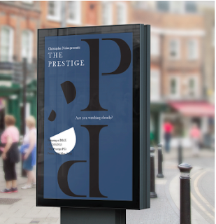
The posters can also work as large scale posters for indoor and outdoor billboards. This would also reach audiences that aren’t/ or don’t access a digital platform. The posters don’t change for these advertisements as they are the same scale. 


Wednesday, 29 April 2015

Type Posters Research

Initially after deciding which director I was going to focus on I felt that the next and secondary part of the research was to look into typographic posters. 


https://www.behance.net/gallery/24395215/Refinery-29


https://www.behance.net/gallery/17449717/The-Hungarian-Guggenheim


https://www.behance.net/gallery/23930261/Made-of-Two-Posters


http://designspiration.net/image/24632824092693/


http://designspiration.net/image/1272206301412/


http://designspiration.net/image/3231015160056/


http://designspiration.net/image/8016793267014/


http://designspiration.net/image/14605972283680/


http://grainedit.com/2014/01/22/les-graphiquants/


http://graphic-porn.com/post/16545009735/http-www-maciejratajski-com


https://www.behance.net/gallery/Ministry-of-sound-_D-AD-Brief/3376983


https://www.behance.net/gallery/17195287/Lamantin-Identity


https://www.behance.net/gallery/24227613/EXTENSION-2014


https://www.behance.net/gallery/24199007/STROKE