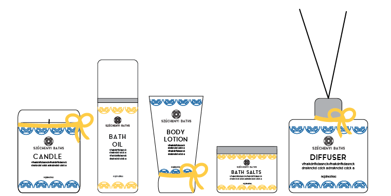
Firstly I drew out the shapes of the bottles that I had ordered, I then researched into home spa products and wrote out a list of potential products. I also got another idea from researching and this was to name the products something associated with being at the spa, and the words would all begin with 'R'. Such as relax, restore and renew.
I also sketched out potential packaging for each product and overall pack, I was deciding between having the bottles in the pack all together or packaging them individually, also how the boxes would open and look, how they could be coherent.
I digitised the bottles so that I could visualise the products, I originally put the logo on the bottles to see how I could be coherent.
Ideas for the label of the bottle, and how I could incorporate the colours of the brand (blue/yellow)
I also thought about adding a ribbon to the product to add and an extra element.
This design would be hard to recreate on a sticker as the shape of the bottle is diagonal which means I couldn't just apply the circles as a line on the design.
Alternative blue and yellow, the circular logo mark is used as a pattern, I did this at either side, and roughly laid out the type and how the logo would work etc.
I also tried the pattern horizontally, I thought that this may be easier to create.
I began drawing out the shapes of the bottles and their individual packaging, I made this decision as I felt that if they where each individually packaged they could be sold as separate items too.
Digital ideas about the packaging.
I added the pattern again this would be a spot varnish I think that this would add a more specialist feel and add a sense of luxury as well as it would be shiny it almost replicated the surface of water.
I came to this idea of a bellyband around the box, this solved a lot of printing issues as they are two separate elements and two separate colours. I also think that it makes the design central unlike the other designs. As well as this the box will be easier to make.
In designing this packaging I decided that the original labels for the bottles where to complicates and needed to be stripped back.
However this looks quite boring, and the yellow wasn't incorporated and so I went back to an idea I had had originally and this was to add a yellow outline to the white box, and so now the labels would be white stickers with a yellow box as a border, this also means that the colour of the liquid inside the bottle won't affect the readability of the type.
Final range (digitised)
Looks coherent, minimal and clean. The colours aren't overpowering or clashing.


No comments:
Post a Comment