Tuesday, 27 January 2015

Packaging Prototypes


After sketching the designs and digitising what they might look like I began to prototype the boxes so that I could practice crafting as I hadn't done this year and I wanted to get better at this skill.


I began by drawing the net of a square box 6x6x6cm.


Cut out net.


Made box. 


I created a belly band for the box, this is where I intend to put the information of the product.


The back of the box shows the type of lock that I had tried, which is a click lock. 


This is how the box would open when the lid is liftedI like the way the box looks like this. 


I then began again but with a different style of lock. The net shows that the box now has a tab and a slit in the middle. 


This lock ensures that the box closes more securely. 


However with the bellyband style the tab is hard to open and close, it pulls on the band as well. 


The boxes together so that I could compare. 


I decided that I liked the click lock more as it doesn't disturb the bellyband. and it looks neater its more suitable for the health and beauty sector. 


I then tried the larger box which will be rectangular, this has a slightly different net shape and folds differently and so it was beneficial to me to try.


The different boxes and different sizes, two of the boxes I remade 2cm smaller as they where too large and the other boxes looked very small and there was too much room when the bottle was placed inside. 


I then moved on to the overall packaging of the products and I decided I wanted to try a more complex net to add a more crafted/ special feel to the pack. 

I looked at a range of nets and I decided upon this one, which had a hexagonal base and fold inwards at the top and ties with a ribbon. 


I drew out and tried the net above, it was hard to get the dimensions right and I found that the base was too big, as well as this the curved lines where hard to cut neatly and hard to score for the folds, and then when I was folding the top together it was hard to bend.

And so I went back to more research and I found a similar net but the top part was square. with triangle bends which was much easier to draw, score and cut. 


This box also went together well and the triangle fold was geometric which is more in keeping with the  other packaging. 

I also added a ribbon that shows how the box closes and the ribbon adds a more feminine touch, and adds a different texture. 


Monday, 26 January 2015

Szechenyi Bath Branding

The original logo is very serious and I feel boring. I don't think that the logo mark represents the baths well at all. 


From looking at the building I looked into the artwork in the building I saw that this was an important piece of art in the building and had significance, I also liked the horses on the cloud I felt that they looked strong, and horses have symbolism of beauty and power, andI felt that this might translate well for the logo. 

I began by tracing around the horses, I didn't want to include every detail, I wanted a more outlined style. 


This was the final outline of the horses with the cloud I think that they work well in this style as well. 


I then looked into the type, and went through a range of serif fonts, I felt a self font would add to the idea of history and elegance, it would add a more formal identity to the baths.


Type with the logo, I chose this font as I liked how the letters where formed with the various weights, however I felt that the image of the horses didn't match.  

I changed the outline of the horses to a varying stroke, and I also changed the type to a script font, this logo looks really formal and elegant. 

I felt that this logo doesn't appeal to the audience of the baths as it isn't a really formal place, it is more fun and relaxing, its reasonably priced and anyone of any age can go (except children) as well as this going back to the older traditional look might not be appropriate now. 

And so I looked into another strong piece of art in one of the domes and looked into making this minimal. 

I drew a out a 2D version of the shape, just drawing the outlines of the shapes, I also decided to add an element of the baths or water I made the third circle out into a wavy one like a ripple. 


I doubled up this line and increased the weight of the stroke. I really liked this logo mark as it draws you in, I like the that its a circle and this reminds me of a pool, I also think that as it is symmetrical it is like a pattern and this is true to the Hungarian style, yet this is modern too.


I found a really appropriate font on Behance, and I used this for the lettering, I decided the logo mark should be in centre as it is a symmetrical logo. The font is also is modern. 


However after designing the bottles and the packaging I felt that the logo looked incomplete as well as this the 'e' actually has an accent and so I added this which is the real way to write the name, as well as this I added an underline as it separates the logo from other elements and adds more balance to the top-heavy logo. 


Bottles and Packaging Digital Development

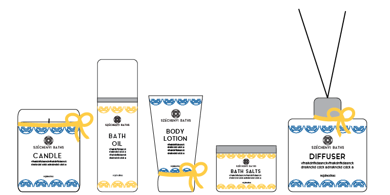
Firstly I drew out the shapes of the bottles that I had ordered, I then researched into home spa products and wrote out a list of potential products. I also got another idea from researching and this was to name the products something associated with being at the spa, and the words would all begin with 'R'.  Such as relax, restore and renew.

I also sketched out potential packaging for each product and overall pack, I was deciding between having the bottles in the pack all together or packaging them individually, also how the boxes would open and look, how they could be coherent. 


I digitised the bottles so that I could visualise the products, I originally put the logo on the bottles to see how I could be coherent. 


Ideas for the label of the bottle, and how I could incorporate the colours of the brand (blue/yellow)


I also thought about adding a ribbon to the product to add and an extra element. 


This design would be hard to recreate on a sticker as the shape of the bottle is diagonal which means I couldn't just apply the circles as a line on the design. 


The range of products: 
Alternative blue and yellow, the circular logo mark is used as a pattern, I did this at either side, and roughly laid out the type and how the logo would work etc.


I also tried the pattern horizontally, I thought that this may be easier to create.


I began drawing out the shapes of the bottles and their individual packaging, I made this decision as I felt that if they where each individually packaged they could be sold as separate items too. 


Digital ideas about the packaging. 
I added the pattern again this would be a spot varnish I think that this would add a more specialist feel and add a sense of luxury as well as it would be shiny it almost replicated the surface of water. 


I came to this idea of a bellyband around the box, this solved a lot of printing issues as they are two separate elements and two separate colours. I also think that it makes the design central unlike the other designs. As well as this the box will be easier to make. 


In designing this packaging I decided that the original labels for the bottles where to complicates and needed to be stripped back.


However this looks quite boring, and the yellow wasn't incorporated and so I went back to an idea I had had originally and this was to add a yellow outline to the white box, and so now the labels would be white stickers with a yellow box as a border, this also means that the colour of the liquid inside the bottle won't affect the readability of the type. 


Final range (digitised)
Looks coherent, minimal and clean. The colours aren't overpowering or clashing.